Mobile Friendly Test
Use the Mobile-Friendly Test tool to check how optimized and friendly a website is on mobile devices. Enter the website URL below and click the "Submit" button to get your analysis.

Processing...
Try Other Relevant Tools
About Mobile Friendly Test
In the past, Google and other search engines didnʼt prioritized websitesʼ mobile friendliness because only a few people surf the internet via their mobile phones. However, that isnʼt the case anymore due to the tremendous increase in mobile internet users.
A report suggests that 92.3% of internet users browse with their mobile devices. As a result, mobile friendliness has become a crucial factor in determining websites' rankings on search engine result pages (SERPs).
Take advantage of our Mobile-Friendly Test tool and check if your website is compatible with mobile devices, like smartphones and tablets.
What is the Mobile-Friendly Test tool?
Our Mobile-Friendly Test tool is designed to analyze your web page and tell if it's responsive on mobile devices. It will examine the graphics, interface, and other aspects to determine whether smartphone and tablet users enjoy surfing your website on their devices.
Benefits and Features
Our mobile-friendly test tool is well-built to reveal how your web performs on smartphones, tablets, and other mobile devices. It will provide a complete report of what mobile phone users experience when they visit your site through their mobile devices. Here are the features that make this benefit possible
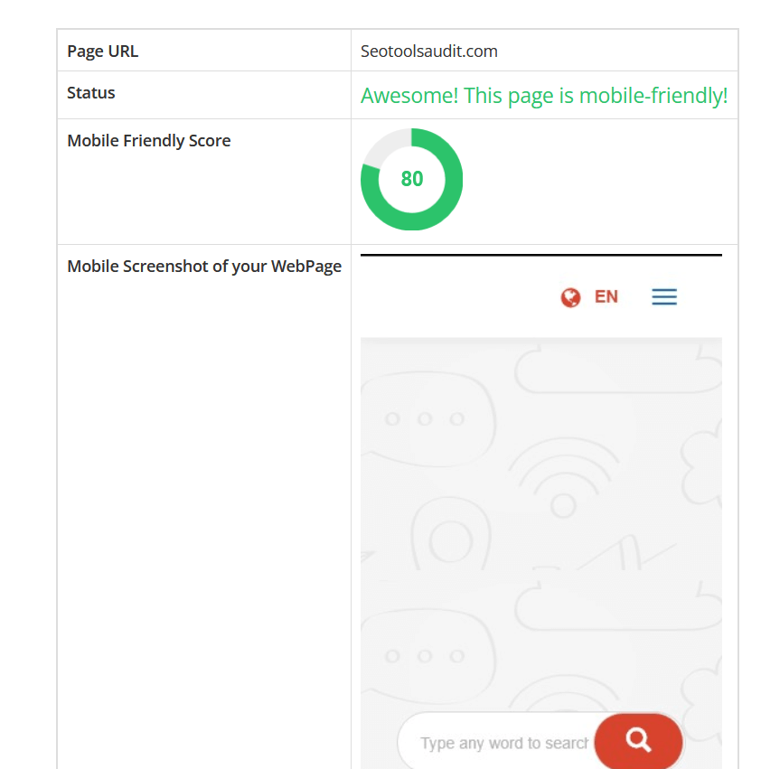
Status
Here's that part where you would know if your website is mobile-friendly or not. The tool will give an: “Awesome! This page is mobile-friendly!” remark if the website has a high mobile friendly score.
On the contrary, you will see a not-too-impressive message if your page doesn't score up to 50%.
Mobile Screenshot of Your WebPage
The Seotoolsaudit Mobile-Friendly Test tool will generate a mobile screenshot of the page you just checked. It will show you a pictorial summary of the page so you can have a perfect idea of how it appears on smartphones and other mobile devices.
Mobile Friendly Score
Our tool will give an accurate and genuine score after analyzing every aspect of the page. The overall mobile-friendly score reflects how your page performs on mobile devices.
Endeavor to score at least 80% if you want a lot of mobile phone users to keep visiting your website after their first visit.
How to Use the Mobile-Friendly Test Tool?
- Go to Seotoolsaudit.com on your browser.
- Select the Mobile-friendly Test. Meanwhile, you can bypass the first and second steps by clicking here.
- Type your page URL in the available space
- Click "Submit" and wait for the report.
How to Improve Your Website Mobile-Friendly Score?
Improve your page's mobile friendliness if the test score is less than 80% by observing the following options:
Install a Mobile-friendly Theme
An unresponsive or slow theme could affect the score. So, ensure you choose the right option for your website.
Optimize the Speed
Choose a hosting company that guarantees fast loading speed. Delete unnecessary widgets and plugins while the homepage shouldn't have too many posts and articles.
Meanwhile, check your website's load speed with our page speed insight checker tool.
Enable Accelerated Mobile Pages on Your Website
Accelerated Mobile Pages (AMP) is a framework that restricts HTML/CSS and compresses site data to boost load times. Enabling such an important feature will improve the site's speed.
Reduce Pop-Up Ads or Promotional Content
Pop-Ups can affect your web page's usability on mobile devices. Hence, disable or reduce unnecessary pop-ups that could discourage people from viewing your website.
Optimize Your Images
Optimize the images on your articles or blog posts. They mustn't be too large so smartphones with small bandwidths won't struggle to load them.
Nonetheless, don't sacrifice images' quality for size. Optimize your page images with our user-friendly Image Optimizer which will produce the best size without affecting the quality
Frequently Asked Questions
Why is a mobile-friendly test important for Website Developers?
Mobile Friendly tests are crucial to website developers because they can assess the page's performance and appearance on mobile devices. The test results will help web developers determine how to increase the page's relevance to mobile device users.
With the report, web developers will decide whether to optimize their webs for smaller screens, improve the speed, or change the theme. All these decisions will eventually lead to seamless user experience, higher engagement, better search engine rankings, and increased conversion rates in the long run.
Are Mobile Friendly Test tools accurate?
Mobile Friendly test tools provide an accurate analysis you can use for your web pages. Though some platforms sometimes overlook subtle issues, our tool will examine every bit of the page while compiling the test result.
Where can you find a Mobile Friendly Test Tool?
Seotoolsaudit offers a mobile-friendly test tool you can trust to deliver accurate and reliable reports for your website. The tool is credible, user-friendly, and has impressive responsiveness.
Research Websites
- https://explodingtopics.com/blog/mobile-internet-traffic
- https://smallseotools.com/mobile-friendly-test/
- https://www.hostinger.com/tutorials/mobile-friendly-website
Available in
LATEST BLOGS
Search
-
Popular Seo Tools
- Plagiarism Checker
- Paraphrasing Tool
- Keyword Position Checker
- Grammar Checker
- Domain Authority Checker
- PageSpeed Insights Checker
- Image Compression Tool
- Reverse Image Search
- Page Authority checker
- Text To Speech
- Backlink Checker
- Backlink Maker
- Domain Age Checker
- Website Ping Tool
- Website Reviewer
- Keyword Density Checker
- Page Size Checker
- Word Counter
- Mozrank Checker